Leverage Turing Intelligence capabilities to integrate AI into your operations, enhance automation, and optimize cloud migration for scalable impact.
Advance foundation model research and improve LLM reasoning, coding, and multimodal capabilities with Turing AGI Advancement.
Access a global network of elite AI professionals through Turing Jobs—vetted experts ready to accelerate your AI initiatives.
FOR DEVELOPERS
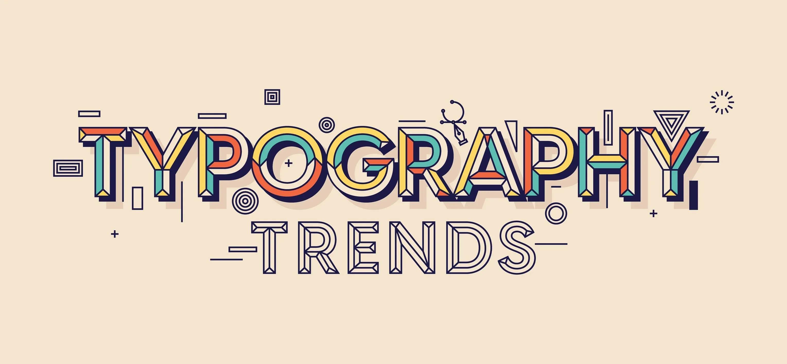
The Classification of Typeface Styles: The Definitive Guide
Typefaces are quite a big game in the realm of design. You have probably heard people talk about font styles, reading styles, and typefaces for magazine articles, if you have spent even the slightest time in it. But that is because there is so much to know about them.
Typefaces are why we design, and they are why we read. They are a crucial part of every visual communication project. As such, the topic of typefaces is both vast and highly technical.
All that reading about typefaces must have made you super knowledgeable.
Has it not?
Let my article walk you through the basics then, from the classification of typefaces to how designers think about them.
Let’s get started!
Table of Contents
- 1. What is a typeface?
- 2. Typography basics
- 3. Font vs. typeface
- 4. Typeface classifications
- 4.1. 1. SERIF
- 4.1.1. Old style
- 4.1.2. Transitional
- 4.1.3. Modern
- 4.2. 2. Sans Serif
- 4.2.1. Grotesque
- 4.2.2. Humanistic
- 4.3. 3. SCRIPTS
- 4.3.1. Formal
- 4.3.2. Casual
- 4.3.3. Calligraphic
- 4.3.4. Handwriting
- 4.4. 4. Blackletter
- 4.5. 5. Decorative
- 5. Conclusion
What is a typeface?
A typeface is a set of fonts (a collection of letters) designed to work well together. In print, they're used to set text in an editorial project. In web design, they're used to select text in a website. You can write or edit text, and the typeface you're using will set the font design for the rest of your project.
Typography basics
Serif typefaces, sans-serif typefaces, script typefaces, monospaced type spaces, and display typefaces are five basic typefaces. People use Serif and sans-serif typefaces for body copy or headlines. Sometimes we can use them for title, logo, or else. Most of them use script and display typefaces for the headline. Not all serif and sans-serif headings are equally suitable for body and headline copy. Different types of those fonts are more readable at small sizes than others, while some of them have better characteristics in your large heading copy.
Font vs. typeface
While most people use font type and typeface, a typographer will tell you they are two terms that refer to different things.
Typefaces are collections of letters, numbers, and symbols with a standard design theme. On the other hand, fonts are specific digital files comprising all the characters of a particular typeface. So, while fonts are technically a part of typefaces, they can be used alone (e.g., Arial or Times New Roman) without the rest of the typeface.
In a nutshell, a typeface has different fonts. For example, typefaces like Helvetica are only made of one font. However, many fonts are inspired by this unique typeface of the iconic Helvetica font.
The typeface is like an album cover, and the fonts are like various songs by that artist. An excellent way to view this relationship would be to think of them as a family - the typeface represents the whole family, just like its album cover. In contrast, fonts represent individual talent in that specific family.
Now that we've covered the difference between font styles and typefaces, let's look at the classifications of typefaces.
Typeface classifications

A typeface is a series of characters, letters, or symbols that share particular design characteristics. There are no complications in choosing typefaces. They can help style an existing draft if you want to create a visual ranking for your project. When in doubt, keep it simple!
Designers follow different philosophies about combining typesetting and how they do so; the anchor or role typeface is often chosen based on what will work best with long chunks of text.
Typefaces are classified based on their visual structure, influences, intent, and historical significance.
1. SERIF
Old style
Old-style typefaces originated between the late 15th and mid-18th centuries. Curved glyphs can characterize with the axis inclined to the left, minimal contrast between thick-and-thin strokes, angled head serifs (curves at the top of a letter), and bracketed serifs. Some typefaces contain an e with a diagonal cross stroke.
Transitional
Typefaces in this category represent 18th-century design transitioning from old to modern. They have these characteristics:
- The axis of curved strokes is barely inclined or more vertical than diagonal.
- There's more contrast between thick and thin strokes compared with old-style typefaces.
- Serifs are more delicate, flat, and bracketed.
Modern
Typefaces in this category originated in the 18th century, transitioning between old style and modern design. They have the following characteristics:
- Curved strokes are not at an angle or more vertical than diagonal.
- There is less contrast between thick and thin strokes than in old-style typefaces.
- Serifs are lighter and flat with no brackets.
2. Sans Serif
Grotesque
The Grotesque style is the first popular sans serif typeface. It has a thinner-than-normal stroke weight and squared curves on some letters, such as in the capital G. The single letter g also had two bowls to it at one point. Later versions of this font type removed these features from its design.
Humanistic
Humanistic type styles attempt to improve the readability of sans serif typeface designs. They blend their structure with classical Roman form, proportions of Roman capitals, and old-style lowercase with a calligraphic influence.
3. SCRIPTS
Formal
Script typeface is excellent for movie titles, book covers, packaging design, etc. Script formal typeface uses a wide range of glyphs. They use it to avoid monotony, with long ascenders and descenders contrasting with short x-height letters. The broad lowercase gives this display typeface its readability and polish.
Casual
Simple scripts look informal as written with a pen or brush. The strokes can be connected, and they tend to have a warm, friendly feel.
Calligraphic
A Calligraphy is a form of art that generally imitates the work of hand-drawn calligraphers. They mimic people's handwriting who use flat-tipped pens and brushes. Calligraphic type style often looks unclear, with irregular strokes.
Handwriting
Handwriting typefaces are typographic interpretations of handwriting or hand printing. In some cases, these font types can be anything from a connected script to something more quirky and bouncy (and irregular).
4. Blackletter
Blackletter typefaces evolved from the earlier handwritten forms of traditional writings and illustrated manuscripts. This style went from writing to typesetting when used to set the Gutenberg Bible. A densely black texture characterizes blackletter-style fonts. They are highly decorated capitals with dramatic thick-to-thin strokes and serifs on their lowercase letters.
5. Decorative
Decorative font style consists of typefaces that do not belong to any other typefaces. Primarily designed for display and having one thing in common, Decorative Font is always distinctive, original, and eye-catching.
Conclusion
Typefaces are a significant part of any design, and choosing one can be tricky. When designing, it's essential to choose a typeface that matches your subject. Make sure you understand why you're using a particular typeface for your topic. Use this guide to understand the basics of typefaces better and how to choose one.
Author

Bhanu Priya
Bhanu Priya is a Technical Content Writer and Digital Marketing Specialist. She's worked with 15+ tech-based & digital marketing companies to develop branding and strategies for several brands in India and US. She's a computer science graduate and has been writing about design, creativity, and technology since 2019.
Frequently Asked Questions

Press

Blog
