Bootstrap With React: How to Setup and Use It
•5 min read
- Languages, frameworks, tools, and trends

Bootstrap is a mobile-first CSS framework. It is one of the leading frontend frameworks in web development with over 162k stars on GitHub and over 4.9 million weekly downloads on NPM.
Benefits of using Bootstrap in a React-powered application include, customization, a large community, faster development with prebuilt components and a responsive grid system reducing development time and efforts.
Setting up a React project
In this section, we're going to set up a new React application with the create-react-app command. The create-react-app command is the easiest way to set up a native React project and is also easy to maintain.
Run the command below to bootstrap a new React app.
or use yarn
Where my-app is the name of our application and a folder will be created with this name on your PC.
After a successful installation, navigate into the my-app directory in your terminal with the cd command below:
Start your app server with any of the commands below:
or using yarn
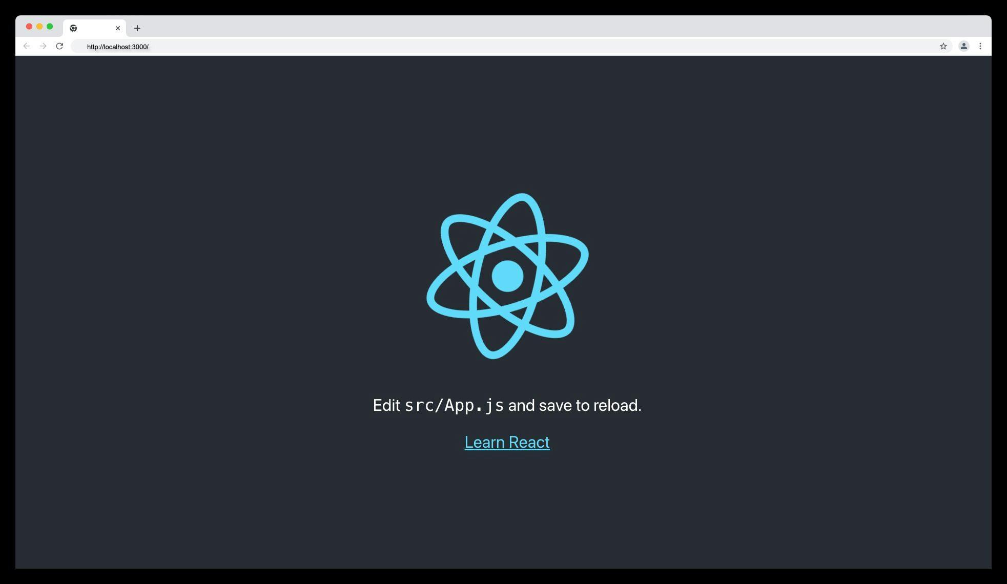
Your server will run on port "http://localhost:3000" or any available port with the screen below:
Installing Bootstrap in a React app
Run the command below to install Bootstrap and its dependencies in your React application.
This installation will allow us to use Bootstrap CSS classes and JavaScript functions in our React application.
Adding Bootstrap files in a React App
After a successful installation of the Bootstrap package, the next step is to import the Bootstrap minified CSS and JavaScript bundle files in the /src/index.js file as shown below.
To confirm that Bootstrap is correctly installed in your React app, replace your app.js file with the following snippet.
If Bootstrap is successfully installed, you should see the following screen:

If Bootstrap is not successfully installed or you comment out the Bootstrap CSS and JS files in index.js, you should see the following screen:

Bootstrap components
Bootstrap offers collections of pre-built HTML, CSS, and JavaScript components to help developers create responsive, mobile-first web applications quickly and easily.
Some of the components provided by Bootstrap are discussed below:
Accordion
A Bootstrap accordion is a user interface component that displays collapsible content sections. It typically consists of a series of headers each associated with a content section that can be expanded or collapsed by clicking on the header as shown below:

PS: For the accordion collapsible to function properly, the Bootstrap JavaScript plugin is necessary.
Navbar
A navbar (short for navigation bar) is a user interface component that provides users with a menu of navigation links. It is usually located at the top of a web page and is used to guide users through various sections of a website or web application as shown below:

Modals
Bootstrap modal is a user interface component that is used to display content on top of the current page or application, in a separate layer or dialog box. Modals are commonly used for displaying lightboxes, user notifications, or custom content.
An example of a Bootstrap modal is shown below:

Pagination
It is a technique that is commonly used in websites and web applications to display lists of items such as search results, product listings, or news articles.
It is used in dividing large amounts of content into smaller, more manageable page links referred to as pagination. Here is an example of pagination.

Placeholders
Bootstrap placeholder refers to a temporary visual element or message that is displayed while content is being loaded.
It is commonly used to provide feedback to users that something is happening or loading and to prevent the page or application from appearing unresponsive or blank. Below is an example of a placeholder in Bootstrap.

Progress bar
The Bootstrap progress bar is a graphical user interface component that shows how far a task or operation has progressed. It is commonly used to indicate how much of a task has been completed and how much work remains.

A progress bar can also be labeled in Bootstrap as shown below:

Basic Bootstrap layout in React
Bootstrap layout refers to the breakpoint, containers, columns, and grid-based layout system provided by the Bootstrap framework that enables developers to create responsive web pages that adapt to different screen sizes.
Bootstrap grid system
The Bootstrap Grid system utilizes the flexbox grid technology to construct a mobile-first 12-column system.

Bootstrap utility classes
Bootstrap utility classes serve the purpose of displaying, hiding, arranging, and providing gaps between elements.
The Bootstrap utility classes are grouped into the following:
- Display property utilities
- Toggle visibility utilities
- Margin and padding or spacing utilities
- Flexbox utilities
Bootstrap breakpoints
As per the documentation of Bootstrap, breakpoints are configurable widths that define the behavior of the responsive layout across various device or viewport sizes in the Bootstrap framework.
The main core concepts of Bootstrap breakpoints include:
- Breakpoints are the building blocks of responsive design
- Use media queries to architect your CSS by breakpoint.
- Mobile-first, responsive design is the goal.
The predefined min-width media query breakpoints in Bootstrap are as follows:
Wrapping up
In conclusion, Bootstrap is a powerful and popular CSS framework that can be easily integrated into a React application to enhance its design and functionality. With the help of pre-built Bootstrap components and a responsive grid system, developers can save more time and effort in the development process.
By following the steps outlined in this article, developers can easily set up and use Bootstrap CSS and JavaScript in their React applications and take advantage of its many benefits.
Troubleshooting common issues
This section covers the common issues when setting up or using Bootstrap with React and how to solve them
- If Bootstrap is not working after installation, ensure you've added the correct Bootstrap CSS and JS files in the src/index.js file.
- Ensure you've added valid Bootstrap classes such as text-primary or bg-primary in your JSX element.
- Ensure your custom CSS file is imported below the Bootstrap CSS file for specificity and to override Bootstrap classes.

Author
Ayodele Samuel Adebayo
Ayodele Samuel Adebayo is a seasoned Technical Writer, and Frontend Dev, his articles have been featured on Hashnode Web3, CopyCat, and ImageKit, he's also a CSE at Hashnode. His articles provide valuable insights and practical tips for developers and enthusiasts.