What is Bootstrap? The Most Detailed Guide on Bootstrap
•8 min read
- Languages, frameworks, tools, and trends

Bootstrap is a point of conversation that many have as web developers. Some use it as a toolkit, some use it just to test, and some do not use it at all. However, to join that conversation, you need to answer one fundamental question: ‘What is Bootstrap?’ Worry not. Today, we are doing just that, answering the most basic questions and guiding you through the intricate yet simple world of Bootstrap. So grab your boots and strap in; this is going to be one hell of a ride.
What is Bootstrap?
Bootstrap is a free front-end framework that makes web development much easier and more efficient. Bootstrap is also considered one of, if not the most widely used HTML, CSS, and JavaScript frameworks for creating mobile-friendly and responsive websites.
In addition, bootstrap also provides various design templates for buttons, tables, navigation, modals, picture carousels, and many more, making it easier to create responsive designs.
Bootstrap allows web developers to focus on development rather than design, rapidly getting a good-looking website up and running.
Conversely, it provides a solid framework for web designers to create engaging Bootstrap themes.
How to Start with Bootstrap?
Once we have answered what bootstrap is, the next big question to tackle and understand is, how can we start with bootstrap? What is the point of knowing what is bootstrap but having no clue how to get started with bootstrap? There is nothing to fret about; we at Turing got you. We will help you go through how to get started with bootstrap, from how to install it to understanding the basic template of bootstrap
- Installation
To install Bootstrap’s source Sass and JavaScript you can either use npm, RubyGems, Composer, or Meteor. However, the documentation and the entire build scripts are not included in package-managed installations. You can also generate a Bootstrap project with npm using the npm template repo.
With npm:
npm install bootstrap@5.2.0-beta1
With RubyGems:
gem install bootstrap -v 5.2.0-beta1
- Basic File Structure
Bootstrap is made up of three main files: Bootstrap.css, Bootstrap.js, and Glyphicons, which include a collection of syntax. Keep in mind that JS plugins and components in Bootstrap require using the jQuery library.
The three main framework files that control a website's user interface and operation are listed below:
- Bootstrap.css
Bootstrap.css is a CSS framework that organizes and controls a website's layout. CSS deals with the layout of a web page, whereas HTML deals with the content and structure. As a result, both structures must coexist to accomplish a certain activity.
Bootstrap.css and its functionalities allow a developer to establish a consistent design across several pages. Consequently, the site developer will save time by not having to perform the manual modification.
Instead of starting from scratch, you may simply point a web page to a CSS file. Any essential changes will be directly made just in that file.
- Bootstrap.js
Bootstrap.js is the most important file in Bootstrap. It is made up of JavaScript files that control the website's interaction.
Developers frequently utilize jQuery, a famous open-source, cross-platform JavaScript library, to avoid coding JavaScript syntax several times.
Here are some things jQuery can do:
- Perform AJAX queries such as dynamically removing data from another place.
- Using a set of JavaScript plugins, create widgets.
- Customize animations with CSS attributes.
- Make the content on the website more dynamic.
While Bootstrap may work perfectly with CSS attributes and HTML components, it requires jQuery to build a responsive design. Otherwise, you can only utilize the CSS language's minimal static components.
- Glyphicons
Glyphicons are icons that are used in Bootstrap. Despite their simple design, they execute their core duties and are free to use. Icons are an important aspect of a website's front-end since they frequently represent actions and data in the user interface.
To adjust the size of Glyphicons, use the CSS font-size property to override the default style.
This is how the basic file structure of Bootstrap looks like:
- bootstrap/
- css/
- bootstrap.css
- bootstrap.css.map
- bootstrap.min.css
- bootstrap-theme.css
- bootstrap-theme.css.map
- bootstrap-theme.min.css
- js/
- bootstrap.js
- bootstrap.min.js
- fonts/
- glyphicons-halflings-regular.eot
- glyphicons-halflings-regular.svg
- glyphicons-halflings-regular.ttf
- glyphicons-halflings-regular.woff
- glyphicons-halflings-regular.woff2
The architecture of Bootstrap is straightforward and self-explanatory. It comes with precompiled files that may be used right away in any web project.
This framework may be simply implemented into your own project's file structure by including the Bootstrap files precisely as they came out of the zip package, or you can rearrange and position them anywhere you wish if it suits your project better. Simply ensure that the Glyphicons fonts folder is located on the same level as the CSS folder.
- Basic Bootstrap Template
This is how a basic Bootstrap template should look like:
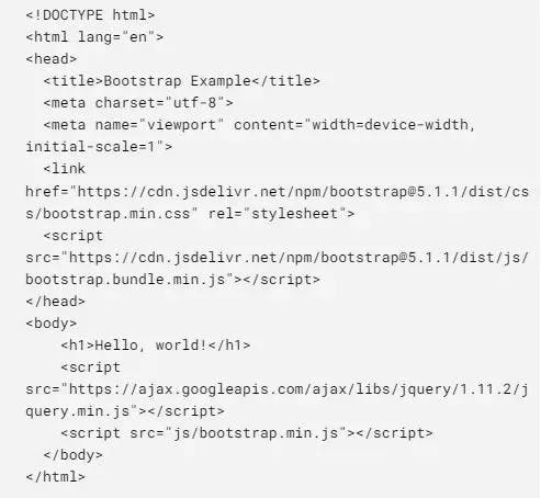
It is very important to begin each HTML page with an HTML 5 Doctype declaration so that browsers know what to anticipate. The head contains key <meta> tags that must be stated first, followed by any extra head tags.
To enable the web page to load before any JavaScript is performed, JavaScript files are placed to the end of the body. Bootstrap plugins need jQuery, which must be loaded before bootstrap.js. You may also remove these files from the source if you aren't utilizing any of Bootstrap's interactive features.
This template is the basic structure that is required to get started with a basic Bootstrap project.
What are Bootstrap Components?
Once we know how to get started with Bootstrap and understand the structure and template, we can start comprehending the idea and concept of Bootstrap Components. The idea of components are best explained through examples and live code, therefore, we urge you to follow the various code provided down and try to add your own flair and flavor to it!
Note: The code below will assume that you have already implemented the basic template.
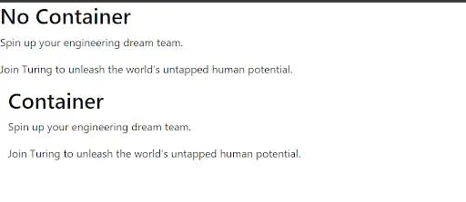
- Bootstrap Containers
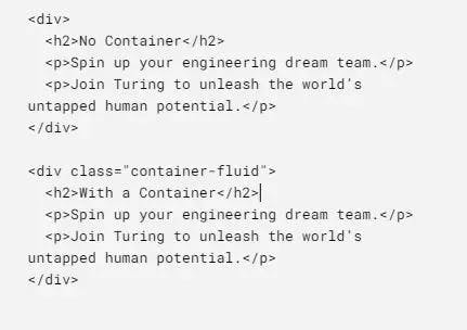
Output:
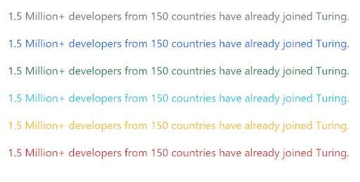
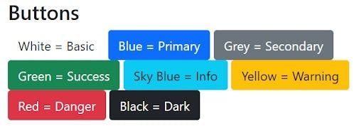
Bootstrap Colors
- Background
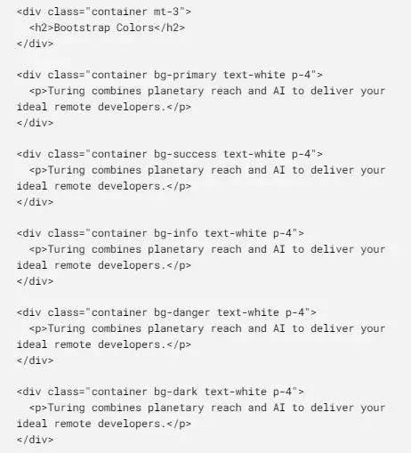
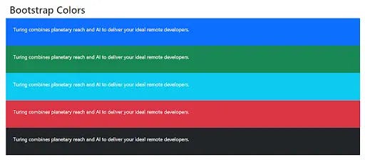
- Text
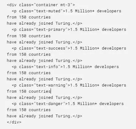
Output:
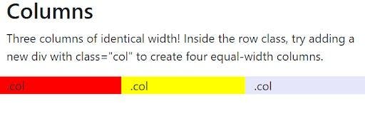
Bootstrap Columns
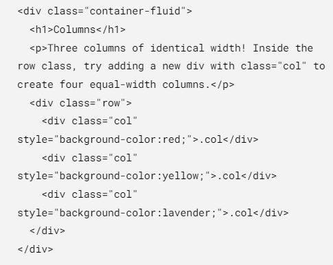
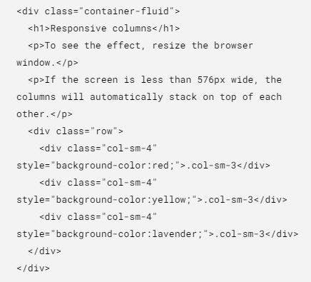
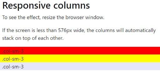
Responsive Columns
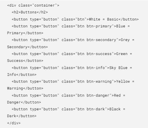
Bootstrap Buttons
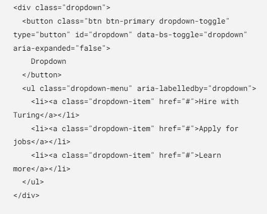
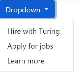
Bootstrap Dropdown
Why learn Bootstrap?
After practicing some Bootstrap examples and testing with a few more, let us understand Bootstrap's various advantages and why you should learn and use Bootstrap in your web development career.
- Simple to Use
Bootstrap's concise file structure is one of the reasons for its popularity among web developers and designers. Its files are assembled for simple access, and changing them takes a basic understanding of HTML, CSS, and JS.
Themes for popular content management systems may also be used as learning tools. Most WordPress themes, for example, were created with Bootstrap, which is now available to any amateur web developer.
Bootstrap reduces the size of the CSS and JavaScript files to speed up the website load time.
Additionally, Bootstrap ensures that the syntax of websites and developers is consistent, which is perfect for collaborative projects.
- The Responsive Grid
Bootstrap has a grid system that eliminates the need to create one from scratch. Instead of adding media queries in the CSS file, the grid system uses rows and columns to create a grid within an existing one.
Additionally, the grid architecture in Bootstrap simplifies the data entering procedure. Therefore, it has several media queries, allowing you to establish specific breakpoints for each column based on your web project requirements.
In most cases, the default settings are sufficient. After you've created a grid, all you have to do now is fill the containers with content.
To better support both desktop and mobile-based projects, the Bootstrap grid system features two container classes: a fixed container (.container) which provides a fixed width, and a fluid container (.container-fluid) that can modify the project to any screen size.
- The Browser Compatibility
Making your website compatible across several browsers reduces bounce rates and helps you rank better in search results. Bootstrap meets this criterion by supporting the most recent versions of major browsers.
- Responsive Image System
With its established HTML and CSS rules, Bootstrap manages image responsiveness and display.
The .img-responsive class will automatically resize pictures to fit the size of the user's screen. The picture size reduction is a part of the site optimization process that will help your website function better.
Additional classes in Bootstrap, such as .img-circle and .img-rounded, may also be used to change the form of pictures.
Why should you NOT use Bootstrap?
Nothing is perfect, and that also includes various pieces of technology. What works for one person may not work for another, which is perfectly fine. You are the person who decides what you should use or not; however, it is only fair that you get to know the reasons why some people might not like using Bootstrap and why you might be one of them. However, you never know if you do not try it out once.
- Consistent Visual Style
Because Bootstrap has a uniform visual design, it necessitates extensive customization and style override to differentiate one project from another. Otherwise, all websites using this framework will have the same navigation, design, and structure elements, making them appear amateurish.
- Too Many Functionalities
Having a high number of functionalities necessitates huge files. If you're not careful, using Bootstrap on your project might slow down the website's load time, putting a strain on your server. To circumvent this problem, only add the classes you require, and the files are minified.
- Incompatible with Older Browsers
While the most recent versions of common browsers are compatible with Bootstrap, earlier ones are not. It means that the appearance of your website will be dependent on consumers' willingness to update their browsers.
- Style Size is too Large
Bootstrap styles are rather large. This might result in superfluous HTML output, wasting resources on the central processing unit.
- Modest Learning Curve
Despite its ease of usage, Bootstrap is not the easiest framework to learn and master. Learning the different classes and components takes time and might be difficult for someone without technical experience.
Wrapping Up?
Yes.
Finally, we end this engaging and fun journey of learning what bootstrap is. From understanding the basic structure to practicing performing the Bootstrap examples, to finally rounding up on whether Bootstrap is suitable for you not, we have covered everything that is possible to cover. However, this is not the end for you. We provided you with the tools and the knowledge, now it is up to you to utilize it and create your own applications utilizing this piece of technology.
Now you can take part in any Bootstrap developer conversation and put your two cents on what you think about Bootstrap. Additionally, if anybody asks you, ‘What is Bootstrap’? You know what to say.