How to Create a Boxplot in Python
•5 min read
- Languages, frameworks, tools, and trends
- Skills, interviews, and jobs

Data visualization is the process of converting information into a visual format in form of charts, images, pictures, and so on, to derive insight from data easily and aid data analytics and business intelligence.
One of the useful data visualization techniques used in deriving insight is the Boxplot in Python.
What is a Boxplot?
A Boxplot also called a whisker plot, is a data visualization technique that visualizes the distribution of data from the dataset provided. It separated the data into a 5-point summary which consists of the minimum point, the first quartile, the median, the third quartile, and the maximum point, with these it shows how data is distributed in a diagram. It can be said to give a summary of the data distribution or variation.
Libraries to be used in creating Python Boxplot
In this article, we will create a Boxplot using 3 different ways or formats. We would make use of these libraries
- Pandas library
- Matplotlib library
- Seaborn library
How to create a Python Boxplot
We start by importing useful libraries and reading the data. We will be using a phone price obtained from Kaggle in this article.
Afterward, we do some more data analysis to find numerical columns for the Boxplots.


From these we will deduce the numerical columns to be used, we’ll now learn how to use these to create Boxplots using the three different methods.
How to create a Boxplot Using Pandas
Creating a single plot in Pandas is quite easy, and very similar when plotting with it to the use of Matplotlib. Matplotlib is a visualization platform integrated into Pandas to make plotting easier.
Single plot
To create a single plot you can use the following syntax:

Where battery capacity is a column in the data frame. And it produces this result.
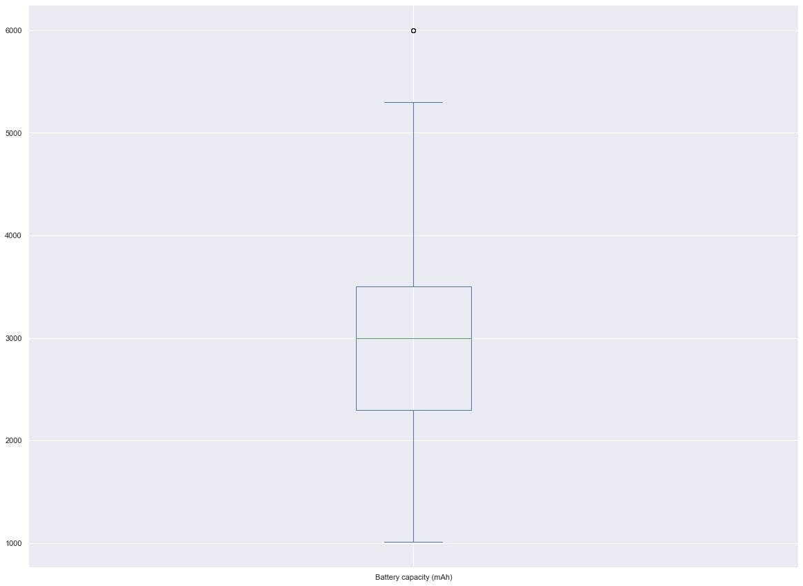
Here we read that the battery capacity distribution is somewhere between 4000 and 2000.
Categorical plot
In a categorical plot, we would plot a numerical column by a categorical column to see the distribution relationship between them. This is done by the following syntax:

As seen, it is possible to directly call the Boxplot syntax from the data frame. This produces the result:

Plotting battery capacity and touch screen we see that most touchscreen phones have higher battery capacity than phones that aren’t touch screens.
Multiple plots
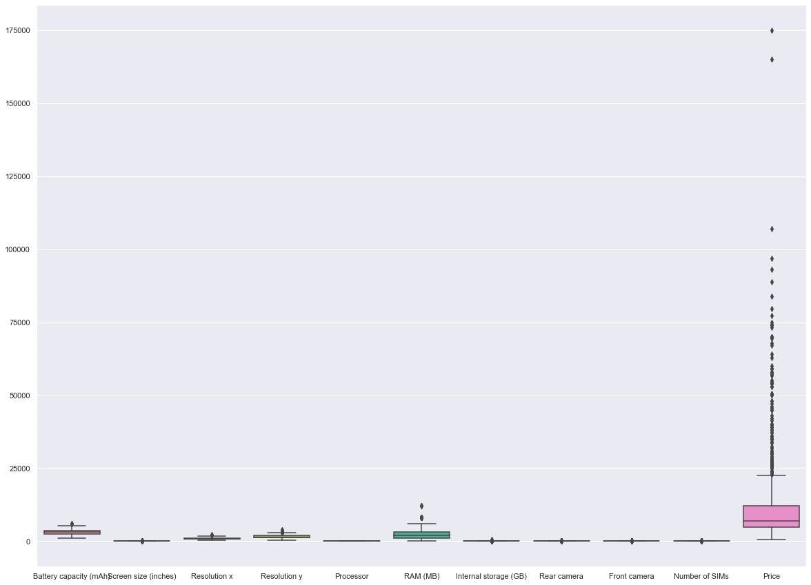
Multiple plots can be done on numerical columns with the syntax:


The diagram is a bit squeezed up due to a large number of outliers, we can adjust it by making the y-axis logarithmic using:

This gives the result:

Which makes the boxes more visible.
How to create a Boxplot using Matplotlib
Matplotlib is a data visualization tool used to create graphs for analyzing and visualizing data.
Matplotlib’s syntax is very complex and confusing, that's why it was integrated and made easier with the use of Pandas and Seaborn.
Single plot
You can create a single plot using matplotlib. pyplot with the syntax:

This gives the diagram a similar look to the one used with Pandas:

Categorical plot
In categorical plotting we have the syntax:

Matplotlib cannot directly convert data frame columns into plots so they have to be changed to arrays in this code and then plotted in the format. This gives the diagram:

Multiple plots
Creating multiple plots becomes more complicated as you may have to manually specify the numerical columns that will be used to turn them into arrays, this can be done by using this:

This gives the figure:

When adjusted logarithmically it gives:


How to create a Boxplot using Seaborn
Seaborn is one of the most popular data visualization tools which, although built on matplotlib, is incredibly easier for users to make plots.
Single plot
The following syntax is used to create seaborn visualization for a single plot.

By specifying the column and the data used, it gives:

Seaborn colors make the plot more visible and easier to understand.
Categorical plot
To make a numerical vs categorical plot you can use this:

The above syntax plots:

Multiple plots
Creating multiple plots with Seaborn is done with the code:

This automatically selects the numerical columns and creates multiple Boxplots:
This can also be adjusted by using matplotlib’s logarithmic function:


Understanding the Boxplot
The Boxplot consists of 5 main points of distribution:
1. The minimum point- The minimum point is the whisker part of the diagram which indicates a lower range of the distribution. It is calculated as one and half times the interquartile range(1.5*IQR).
2. The first quartile or 25th percentile- This is the lower part of the actual box which shows the lower distribution of data points. It is the lower part of the interquartile range. It is the lower quartile Q1.
3. The median or 50th percentile- This is the line drawn inside the box, it indicates the middle point of the distribution.
4. The third quartile or 75th percentile- This is the upper part of the box which indicates the upper part of the distribution. It is represented by Q3.
5. The maximum point- This is the top whisker point which is one and half times the interquartile range and added to the third quartile.
In addition to these, in some Boxplots, there are little dots that indicate outlines. Outliners are points in the data which fall out far from the distribution, it is abnormally away from the related distribution.
Uses of a Boxplot
The following are the uses for constructing Python Boxplots:
- You get an idea of the whole data and how it is distributed
- You can understand when the data is positively or negatively skewed
Conclusion
This article is an introduction to the Boxplot in Python and how to create a Boxplots using 3 different libraries. We have seen how Boxplot can be created using Pandas, Matplotlib, and Seaborn. Keeping 3 aspects of each library in mind, namely single plot, categorical plot, and multiple plots we have described how Boxplots can easily be created.

Author
Ezeana Michael
Ezeana Michael is a data scientist with a passion for machine learning and technical writing. He has worked in the field of data science and has experience working with Python programming to derive insight from data, create machine learning models, and deploy them into production environments.