How Do You Rotate Text in CSS?
•7 min read
- Languages, frameworks, tools, and trends
- Skills, interviews, and jobs

Imagine a website without any styles or designs. How will it look? Certainly, these websites will fulfill the primary objective. But, apart from that the website will not be able to attract viewers or end users. And because of this design issue, the website will lose its value. To tackle this issue CSS came into the picture. Imagine a website with rotating text in it. Isn’t that wonderful? In this article, we will look into one of the important properties of CSS called the CSS text rotate property which can add visual interest to our designed websites.
Brief about CSS
Before knowing about the CSS text rotate property, we have to understand what exactly is CSS. CSS stands for Cascading Style Sheet. With the help of CSS, we can target every HTML element present in the website and can manipulate and give desired design to them. CSS saves a lot of time while designing a web page as we can give styling to multiple elements and sections at once. In simple words, we can say that CSS is used to make a website more attractive and user-friendly.
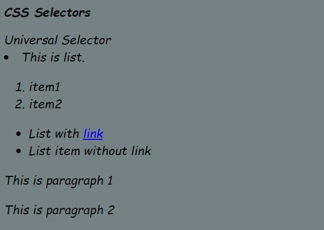
Let’s see an example for a better understanding:
Here, we have applied some CSS to the HTML code. “*” means we have targeted every HTML element and applied these styles to them. So, below is the output of these codes.
Result:
Now, that we know what CSS is and how it works. Let’s move to the next part of rotating the text in CSS.
How to rotate text in CSS
To implement the CSS text rotate property or style in our web page we basically can use the following methods:
- Using writing-mode
- Using text-orientation
- Using rotate property of CSS
- Using the function rotate() of the transform property of CSS
These are the four ways in which rotating text in CSS can be done. Now, we will look into the details of these four methods.
Using writing-mode
Let us now explore the first way by which implementation of CSS text rotate can be done i.e, using the writing-mode.
Syntax:
What is the significance of the values of the writing-mode property:
- horizontal-tb: For this value, the texts are placed horizontally from left to right for the left-to-right scripts and the texts are placed horizontally from right to left for right-to-left scripts.
- vertical-rl: For this value, the texts are placed vertically from top to bottom for the left-to-right scripts, and the next vertical line is placed to the left of the previous line. And the texts are placed vertically from bottom to top for right-to-left scripts and the next vertical line is placed to the right of the previous line.
- vertical-lr: For this value, the texts are placed vertically from top to bottom for the left-to-right scripts, and the next vertical line is placed to the right of the previous line. And the texts are placed vertically from bottom to top for right-to-left scripts and the next vertical line is placed to the left of the previous line.
- sideways-rl: For this value, the texts are placed vertically from bottom to top for the left-to-right scripts and the texts are placed vertically from top to bottom for right-to-left scripts. All the texts and characters are set sideways towards the right.
- sideways-lr: For this value, the texts are placed vertically from top to bottom for the left-to-right scripts and the texts are placed vertically from bottom to top for right-to-left scripts. All the texts and characters are set sideways towards the left.
Let us look at an example:
Output of the code:

Here, we have used the property writing-mode on the tag h3 containing the word “heading” and because of the value vertical-rl, the text is rotated as shown in the above output.
Using text-orientation
Let us now explore the second way by which implementation of CSS text rotate can be done i.e, by using the text-orientation property. This property only works when the writing-mode is set to vertical-lr or vertical-rl. It does not work for horizontal mode.
What is the significance of the values of text-orientation property:
- mixed: For this value, the horizontal texts are rotated 90 degrees clockwise. This is the default value of the text-orientation property.
- upright: For this value, the characters of horizontal texts are placed in an upright manner.
- sideways: For this value also, the horizontal texts are rotated 90 degrees clockwise and the placement of characters remains the same as they are placed in the horizontally laid text.
- sideways-right: This value is an alias for sideways. It is kept for compatibility purposes.
- use-glyph-orientation: This keyword leads to the use of the deprecated SVG properties such as, glyph-orientation-vertical and glyph-orientation-horizontal.

Here, we have used the property writing mode on the tag h3 containing the word “heading” and due to the value upright of the text-orientation property, the text is rotated as shown in the above output.
Using rotate property of CSS
Let us now explore the third way by which implementation of CSS text rotation can be done i.e, by using the rotate property of CSS.
This property turns the text or element around one or more axes in a clockwise and counterclockwise direction. The angle values of the rotate property are provided in degree, gradian, radian, or turn value.
What is the significance of the values of rotate property:
- none: This is the default value. For this, no rotation is applied.
- angle: This is the numeric value expressed in deg, rad, grad, or turns. This value specifies how much the text will be rotated around the z-axis.
- axis name plus angle value: For this value, the text will be rotated around a specified axis and how much the text will be rotated is determined by the angle value provided.
- vector plus angle value: For this value, the three numbers represent an origin-centered vector that defines a line around which the text will be rotated and the angle specifies how much it will be rotated.
Output for the code:

Here, we have used the property rotate on the tag h3 containing the word “heading” and due to the value -45deg of rotate property, the text is rotated counterclockwise as shown in the above output.
Using the function rotate() of the transform property of CSS
Let us now explore the fourth way by which implementation of CSS text rotate can be done i.e, by using the rotate() function of the transform property. With the help of this property, we can rotate, skew or translate an element or text according to our requirements. Out of all the mentioned properties, this transforms property and rotate() function is used mostly when applying the style of rotating text in CSS.
The texts or elements rotate around the transform-origin. The transform-origin is a fixed point around which the text or elements rotate. The default value is the center, but we can also use our custom values.
What is the significance of the values of rotate():
- none: For this value, no transform is applied and the text or the element will not be rotated.
- transform-function: Multiple transform-function can be applied. For rotating the text we usually apply the rotate() function.

Here, we have used the function rotate() of the transform property on the tag h3 containing the word “heading” and on the p tag containing the content of the paragraph, and due to the value -45deg of rotate(), the text of heading and paragraph is rotated counterclockwise as shown in the above output.
Apart from rotating the text, we can also use CSS animation to animate the rotation of the text. We can achieve this feature by using CSS keyframes. With the help of keyframes, we can specify the start and the end states, and we can also specify the intermediate state if required.
Let us look at an example of keyframes:

In this example, as described in the codes we have used keyframes and applied animations on the heading and paragraph.
Conclusion
In this article we came to know about the CSS text rotate feature. Rotating text in CSS gives our website an appealing design and a dynamic look. Whether to rotate a heading, a paragraph, or any other text on the webpage, this job can be easily done with the help of the “writing-mode”, “text-orientation”, “rotate” property, and “rotate()” of the transform property. On top of that, using animations makes the website more appealing to the end users.

Author
Imbeshat Aslam
Imbeshat is a Web Development Enthusiast. A Frontend Developer, who is carving his path towards Fullstack Development. In his spare time he loves to write technical blogs and loves contributing to Open Source Projects.