How to Build Responsive Layouts Using CSS Grid
•14 min read
- Languages, frameworks, tools, and trends

Responsive web design is essential in today's web development landscape due to the diversity of devices and screen sizes. Ensuring that your website looks and functions well across this spectrum is paramount. CSS Grid, a relatively recent addition to web development, has made the creation of responsive layouts significantly easier. This article will guide you through the process of building responsive layouts using CSS Grid.
Understanding responsive layouts
A layout in web development refers to how content is organized on a page. It can range from a single column to multiple columns, grids, lists, or a combination of these. When designing a layout, it's crucial to consider the device's screen size. For example, a layout designed for a mobile device should cater to smaller screens, while a desktop layout should accommodate larger screens.
When targeting multiple devices and screen sizes, you may opt for a single, adaptable layout or multiple layouts optimized for each screen size. Simple layouts, like single-column designs, can often work well across various screens. However, more complex layouts may require distinct versions tailored to specific screen sizes.
Responsive layouts are designed to adapt seamlessly to different device types and screen sizes, including desktops, laptops, tablets, and mobile phones. For instance, a layout with three columns on a large screen should be reconfigured to two columns on a medium-sized screen and a single column on a small screen.
Creating responsive layouts was historically a complex task, involving a combination of techniques such as tables, CSS floats, media queries, and CSS flexbox, each with its advantages and disadvantages. However, the CSS grid simplifies this process significantly.
Understanding CSS grid
CSS grid is a two-dimensional layout system that allows you to create rows and columns. This sets it apart from one-dimensional systems like CSS float and CSS flexbox, which handle either rows or columns but not both simultaneously. CSS grid empowers you to design intricate layouts with ease.
Key CSS grid terminologies
Before diving into creating responsive layouts with CSS Grid, let's learn about essential terminologies:
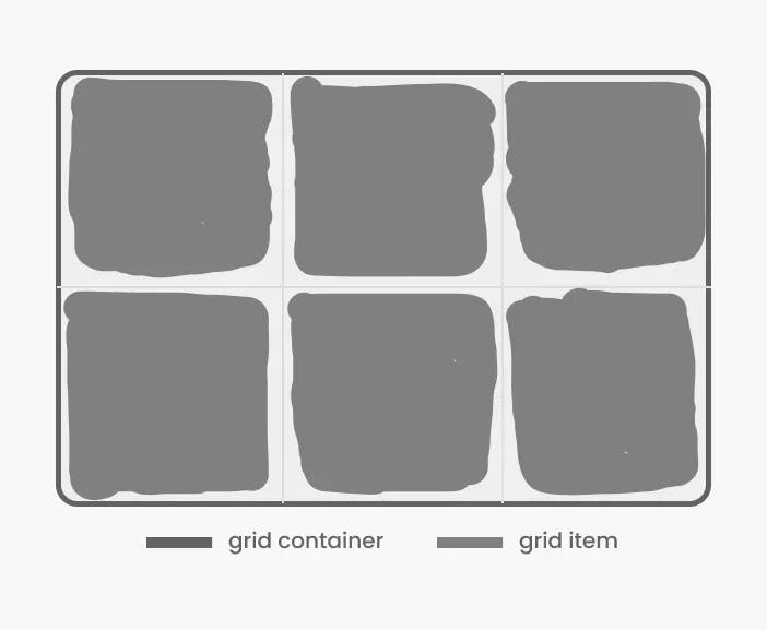
1. Grid Container: An element set to display as a grid. It acts as the parent of all grid items.
2. Grid Item: An element directly nested within a grid container. Grid properties applied to the container affect these items.
3. Grid Line: The lines separating rows or columns, define the grid's structure. Grid lines are numbered positively (1 to n) and negatively (-1 to -n) for easy reference.

4. Grid Cell: The smallest unit within a grid layout, bounded by four grid lines. It's where you place your content.

5. Grid Track: The space between two grid lines, either in a row or column direction. Think of them as horizontal and vertical tracks across the grid.

6. Grid Area: A rectangular area enclosed by four grid lines, capable of containing multiple grid cells. Grid areas can span across multiple rows and columns and can be named for easy reference.

Now that we've covered these terms, let's explore some crucial CSS Grid properties.
Key CSS grid properties
CSS grid offers a multitude of properties, but let's focus on the most commonly used ones:
For the grid container
1. display: Determines the grid container's display type, which can be set to grid or inline-grid.
2. grid-template-columns/grid-template-rows: Defines the grid's number of columns and rows. These properties accept fixed values, relative values, or fractions of available space. They can also be set to auto for automatic sizing based on content.
3. grid-column-gap/grid-row-gap: Specifies the size of gaps between columns and rows. These values can be fixed, relative, or a fraction of available space.
4. align-items: Sets the alignment of grid items along the block (column) axis, with options like start, end, center, stretch, or baseline.
5. justify-items: Defines the alignment of grid items along the inline (row) axis, offering options like start, end, center, stretch, or baseline.
6. Fractional Unit (fr): A unit in a grid layout representing a fraction of the available space within the grid container. It's handy for creating flexible and responsive layouts.


For grid items
1. grid-column-start/grid-column-end: Sets the starting and ending positions of grid items along the block (column) axis. They can be set as numbers, names, or span to span multiple columns.
2. grid-row-start/grid-row-end: Establishes the starting and ending positions of grid items along the inline (row) axis. They can be set as numbers, names, or span to span multiple rows.
3. grid-column/grid-row: Shorthand properties for grid-column-start and grid-column-end, and grid-row-start and grid-row-end, respectively. They can be set as numbers, names, or span to span multiple columns or rows.
4. align-self: Controls the alignment of grid items along the block (column) axis, with options like start, end, center, stretch, or baseline.
5. justify-self: Manages the alignment of grid items along the inline (row) axis, offering choices like start, end, center, stretch, or baseline.
The comprehensive CSS Grid properties list is available here.
Creating a basic grid layout
Now that we've familiarized ourselves with CSS grid terminology and properties, let's create a basic 3x3 grid layout as an example. We'll set up the HTML structure and apply CSS styles.
HTML Structure:
CSS Styles:

This code results in a straightforward 3x3 grid with equally sized columns and rows, serving as a foundation for more complex layouts.
Creating a complex grid layout
Now that we've mastered the basics, let's dive into creating a more intricate grid layout to showcase CSS Grid's flexibility. In this example, we'll craft a complex grid with varying column and row sizes, including nested grids.
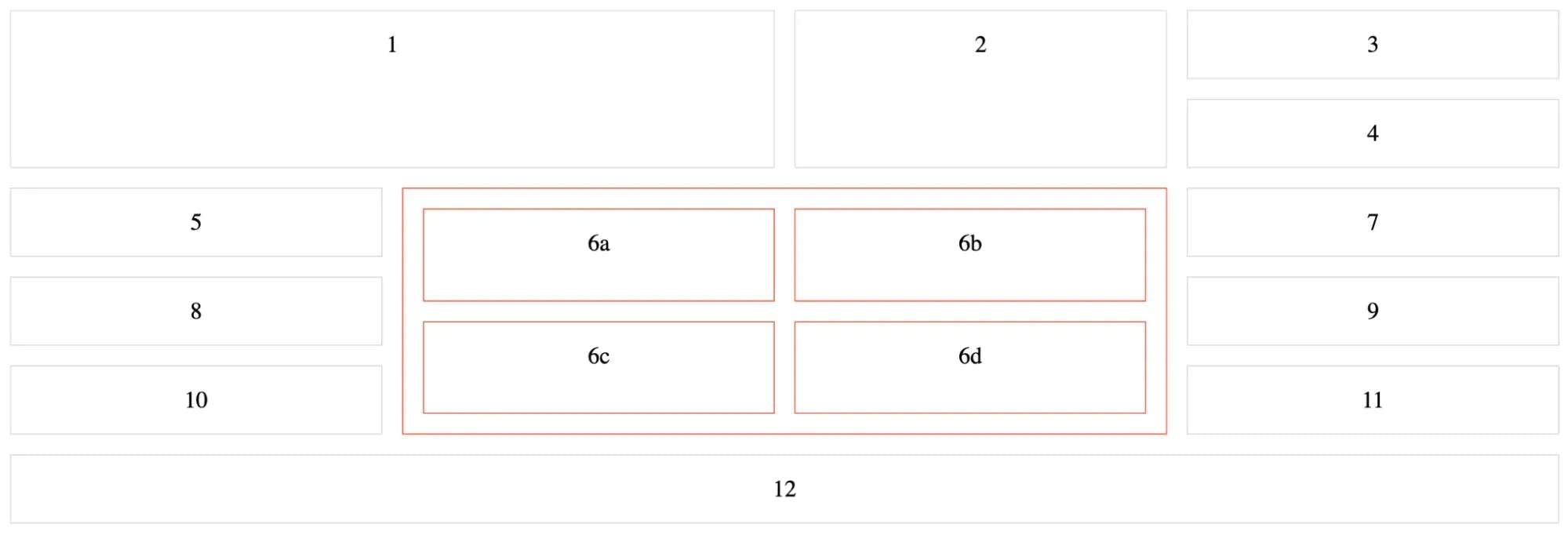
The result is a complex grid layout that showcases CSS Grid's capabilities.
Special units and functions in CSS grid
Before delving into creating responsive layouts using CSS Grid, we must familiarize ourselves with some special units and functions that play a crucial role in achieving flexible and adaptable grid structures. These tools provide the foundation for building responsive grids that respond elegantly to different screen sizes and orientations, enhancing the user experience across various devices.
Fractional units (fr)
One of the most powerful features of CSS grid is the introduction of fractional units, denoted as fr. Fractional units distribute available space within the grid container proportionally. For example, if you define column widths as 1fr 2fr, the first column takes one part of the available space, while the second column takes two parts. This flexibility allows columns to adapt dynamically to varying container sizes, making it an excellent choice for responsive layouts.
Auto-sizing (auto)
The auto keyword is another valuable tool in CSS Grid that simplifies responsive design. When applied to grid tracks (columns or rows), it automatically sizes the track to accommodate its content. This keyword can be particularly useful when you want a grid to adjust to the content's size, ensuring it remains responsive without excessive manual adjustments.
Percentage units (%)
CSS Grid supports using percentage units (%) for specifying column and row sizes. By setting column widths or row heights as percentages, you can create grids that adapt proportionally to the container's width or height. This approach is ideal for achieving fluid, responsive layouts.
repeat() function
The repeat() function is a convenient way to specify repetitive patterns within grid templates. It takes two arguments: the number of times you want to repeat a pattern and the size of each pattern. This function is handy when creating a consistent layout with several identical columns or rows.
For example, to create a grid with three columns, each sized at 1fr, you can use the repeat() function like this:
It simplifies the code and makes it easier to maintain, especially when adjusting the number of columns. It's an excellent tool for creating responsive grids with a predictable structure.
minmax() function
The minmax() function is a versatile tool that allows you to define a range of acceptable sizes for grid tracks. It takes two arguments: a minimum size and a maximum size. This function is beneficial for setting constraints on grid tracks, ensuring they remain responsive while preventing them from becoming too small or too large.
Understanding these special units and functions in CSS Grid provides the foundation for creating responsive and adaptable layouts. With these tools at your disposal, you'll be well-equipped to craft grid-based designs that seamlessly adjust to various screen sizes and orientations, enhancing the user experience across a wide range of devices.
Creating responsive layouts with CSS grid
Creating responsive web designs with CSS grid is a dynamic process that allows us to adapt layouts as per various screen sizes and devices. CSS grid provides several techniques to achieve responsiveness, ensuring your content looks and functions optimally across the spectrum of devices. Let's explore these approaches:
Media queries and breakpoints
Media queries are fundamental in creating responsive designs with CSS Grid. By defining breakpoints in your CSS, you can alter the grid layout based on the device's screen width or other characteristics. They allow you to reconfigure the grid for different devices and orientations. For instance:
The above example starts with a three-column layout for larger screens. However, when the screen width is 768 pixels or less, we use a media query to adjust the grid properties. The grid is reconfigured to two columns for smaller screens, ensuring the content is displayed logically.
Relative units: fr, auto, and percentages
CSS grid introduces the concept of fractional units (fr), which distribute available space proportionally. Using fr units, you can create flexible grids that adapt to the container's size. Additionally, you can use auto and percentages to achieve dynamic sizing.
Example with fr units:

In this example, the first column takes one part of the available space, the second takes two parts, and the third takes three.
Example with auto units:

In this example, the columns are sized based on content, ensuring that the grid adapts to the content's size. It helps create responsive layouts that adjust to varying screen sizes.
Example with percentage units:

In this example, the first column takes up 30% of the available space, and the second takes up 70%. This approach is ideal for creating fluid, responsive layouts.
grid-template-areas for different layouts
The grid-template-areas property lets you define named grid areas within your layout.
You can create different layouts by specifying different templates for various breakpoints.
Example with grid-template-areas:
On the large screen:

On the small screen:

In this example, we switch from a two-column layout to a single-column layout on screens with a maximum width of 768 pixels. The content is displayed in a logical order for smaller screens.
Reordering and stacking grid items
CSS grid allows you to manipulate the order of grid items, making it possible to stack items for smaller screens or change their arrangement based on content priority. The lower the order value, the earlier the item appears in the visual layout. This is done using the order property. By modifying the order property within media queries, you can control the visual hierarchy of content for various screen sizes, ensuring a seamless, responsive design.
Example for Reordering:


In this example, we start with a two-column layout for larger screens. However, when the screen width is 768 pixels or less, we use a media query to reorder the grid items. The first item (with content "1") is reordered to appear after the second item (with content "2") in the visual layout.
These are just a few techniques you can employ to create responsive layouts using CSS Grid. Combining these methods and adjusting grid properties based on your design requirements and breakpoints allows you to achieve elegant and adaptable layouts. These will enhance the user experience across various devices and screen sizes.
A complex responsive layout example
In this section, we'll dive into a complex example to demonstrate how CSS grid can be used to create intricate and highly responsive layouts. We'll combine the techniques and concepts you've learned so far, including the use of special units, functions, media queries, grid-template-areas, reordering, and nesting grids. This example will push the boundaries of what you can achieve with CSS grid.
To start, let's define the HTML structure for our complex layout:
Now, we'll set up our CSS Grid to respond to different screen sizes and content priorities:
On large screens:

On tablet screens:

On mobile screens:
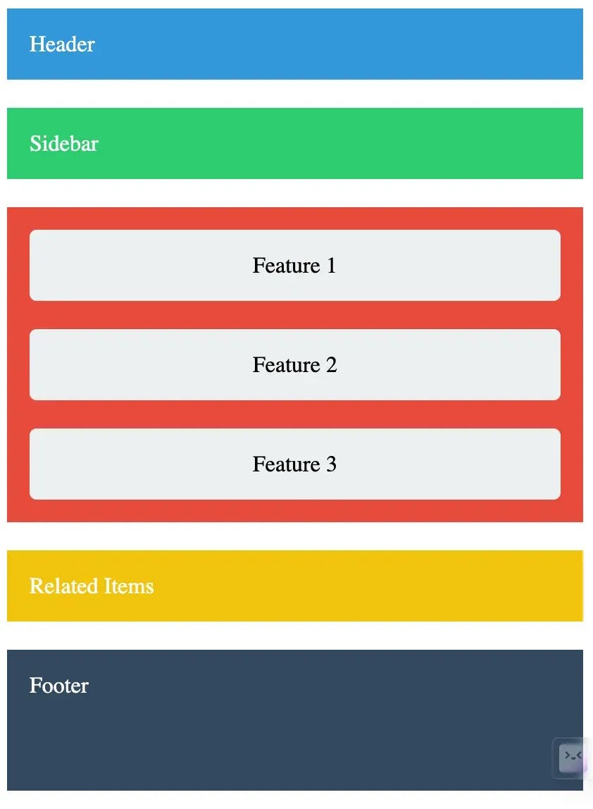
Key points from the example
1. Grid template columns and rows: We use grid-template-columns and grid-template-rows to define the grid structure for our header, sidebar, content, related, and footer.
2. Grid template areas: The grid-template-areas property assigns specific areas to each part of our layout.
3. Media queries: For screens with a maximum width of 960px, we adjust the grid to have two columns, with the sidebar and related items below the content items. For screens with a maximum width of 480px, we switch to a single-column layout, with the sidebar above and related items below the content items. We also reorder the feature sections to ensure they appear logically.
4. Reordering: We use the order property to reorder the feature sections for smaller screens logically.
5. Nested grid: Inside the content area, we create a nested grid to arrange the feature sections responsively. We use repeat(auto-fill, minmax(200px, 1fr)) to ensure the feature sections adapt to the available space.
6. Styling: We apply background colors, padding, and styling to enhance the visual appeal of our layout.
This complex example illustrates how you can leverage CSS Grid to create sophisticated and responsive layouts. By combining various grid properties and techniques, you get the flexibility to design intricate web interfaces that adapt seamlessly to different screen sizes and orientations.
Feel free to experiment further with this example on CodePen, adding your content and customizations to see how far you can push the boundaries of CSS Grid in responsive web design.
Browser compatibility
CSS Grid is supported by all major browsers, including Chrome, Firefox, Safari, Edge, and Opera. However, it's always a good idea to check the Can I Use website for the latest information on browser compatibility.
Tips and best practices
Creating responsive layouts with a powerful CSS grid can result in a versatile tool, but following best practices is important to ensure your designs are efficient, maintainable, and accessible. Here are some tips and best practices to optimize your responsive layouts with CSS grid:
Use semantic HTML structure
Always start with a solid foundation of semantic HTML. Use HTML elements that reflect the structure and purpose of your content. Semantic elements like "<header>, <main>, <nav>, <section>, and <footer>" provide clarity and help assistive technologies understand the page's structure.
Using semantic HTML not only enhances accessibility but also simplifies your CSS Grid layout. By defining meaningful sections, you can apply grid properties to specific elements, making your layout more intuitive to work with.
Proper naming conventions for grid areas
When defining grid areas using grid-template-areas, choose clear and descriptive names for each area. Meaningful names make your code more readable and understandable, especially when collaborating with others or revisiting your code later.
For example, instead of using generic names like "header," "content," and "sidebar," consider using names that reflect the content's purpose, such as "main-header," "main-content," and "side-nav."
Debugging and testing techniques
Debugging CSS Grid layouts can be challenging due to their complexity. Here are some techniques to streamline the debugging process:
Grid inspection tools: Take advantage of browser developer tools that include grid inspection features. These tools visually highlight grid lines and areas, making inspecting & debugging your layout easier. Some browsers offer a dedicated Grid Inspector tool that provides detailed information about your grid layout, including grid lines, areas, and item placement. This tool can be invaluable for diagnosing layout issues. An example is the Chrome DevTools.
Check for Alignment Issues: Pay close attention to alignment issues, such as items not lining up as expected or overflowing grid areas. Double-check your alignment properties, such as align-items and justify-items.
Test on Multiple Devices: Regularly test your responsive layout on various devices and screen sizes to ensure it behaves as expected. Emulators and real devices can help identify issues specific to certain configurations.
Maintain a mobile-first approach
Adopting a mobile-first approach to CSS Grid layouts is an effective strategy. Start by designing and coding for the smallest screens (mobile devices) before progressively enhancing the layout for larger screens. This approach ensures a solid foundation for responsive design and encourages a focus on essential content and functionality.
Prioritize accessibility
Accessible web design is crucial for reaching a diverse audience. Ensure your CSS Grid layouts are accessible by providing appropriate semantic markup, keyboard navigation, and ARIA (Accessible Rich Internet Applications) roles and attributes. Test your layouts using screen readers and other accessibility tools to identify and address potential issues.
Optimize performance
Efficient CSS Grid layouts can contribute to faster page loading times. Minimize unnecessary grid items, use appropriate sizing units (such as fr, auto, and percentages), and leverage browser caching and compression techniques to optimize performance. Remember that overcomplicated grids with numerous tracks and items can negatively impact performance.
Document your layout
Maintain clear and concise documentation for your CSS Grid layouts. Include comments in your CSS code to describe the purpose of each grid area, explain complex layout decisions, and provide context for future developers working on the project. A well-documented layout is easier to understand, modify, and maintain.
By following these tips and best practices, you can create responsive layouts with CSS Grid that are not only visually appealing but also maintainable, accessible, and efficient. CSS Grid empowers you to design complex and adaptable layouts, and with the right approach, your web projects will shine across various devices and screen sizes.
Conclusion
CSS Grid is a powerful tool for building responsive layouts that adapt gracefully to different screen sizes and devices. You can create intricate and responsive designs by mastering the fundamental concepts of CSS Grid, including grid containers, grid items, grid lines, grid tracks, and grid areas.
Furthermore, special units like fr, auto, and percentages, along with functions like repeat() and minmax(), provide the flexibility needed to craft responsive grids. Combining these units and functions with media queries, grid-template-areas, reordering, and stacking techniques, you can design layouts that respond effectively to varying screen sizes and orientations.
With a solid understanding of CSS Grid and its responsive design capabilities, you can confidently create web layouts that deliver an exceptional user experience on desktops, laptops, tablets, and mobile devices. As the web continues to evolve, CSS Grid remains a valuable asset for modern web development, empowering you to build responsive, visually appealing, and user-friendly websites.
Start experimenting with CSS Grid today and unlock its full potential in your web design projects. Whether you're working on a personal blog, an e-commerce site, or a web app, CSS Grid is a versatile and essential tool for crafting responsive layouts that shine in the ever-changing landscape of web development.
Remember, practice is key to mastering CSS Grid, so don't hesitate to experiment, build, refine your skills, and follow the best practices. As you become more proficient, you'll discover new ways to leverage CSS Grid to create stunning, responsive web designs that captivate your audience across all devices.
Happy designing!

Author
Timonwa Akintokun
Timonwa is a front-end engineer and technical writer who excels at both development and communication. She has a love for learning and sharing knowledge, and is always seeking out new opportunities to grow and share her expertise.