How to Apply the CSS Box-Shadow Property to Elements?
•5 min read
- Languages, frameworks, tools, and trends

A simple website is not enough to convert your online visitors to your customer. Websites are meant to take the website visitors on an aesthetically pleasing journey. To curate such a masterpiece, designers usually play with the hues, shades, fonts, and much more. However, shadows of website elements play a significant role in bringing the website to life. In this article, we will discuss about CSS box-shadow property and how to implement them to CSS elements.
But first, let’s get you acquainted with the basics.
What is box-shadow property?
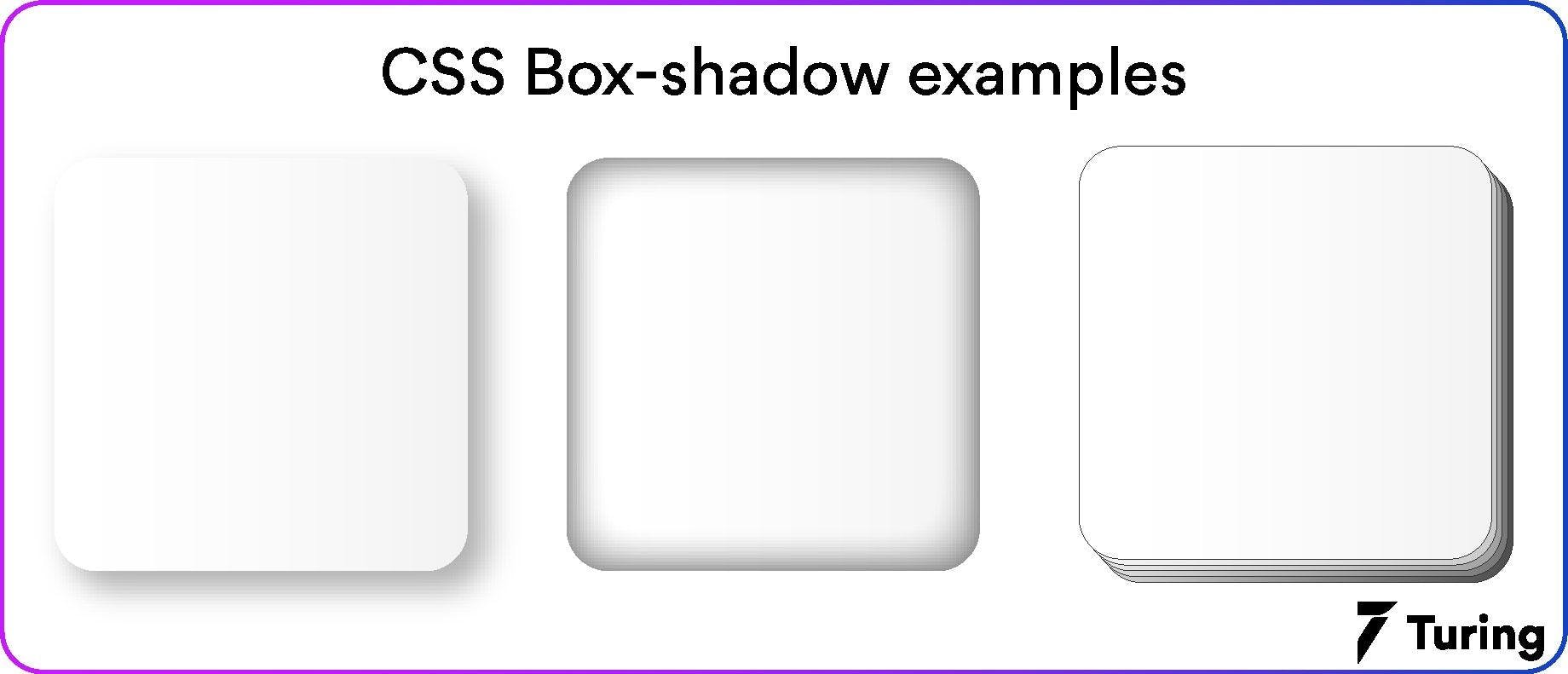
The box-shadow property in the CSS allows you to cast one or more shadow effects on an element. It adds a shadow around the element's frame. You can also add multiple effects to an element by separating them with commas. We do this to add size and depth to an object, thus bringing realism to your website.
Here’s how it looks.
Now that you are aware of what exactly we are going to apply to an element, let’s move on to the parameters that will be required for this task.
Important parameters for generating shadow on an element
We define a box shadow CSS by X and Y offsets, blur radius, and spread regarding the element.
- X offset: It represents the horizontal shadow position of the element.
- Y offset: It represents the vertical shadow position of the element.
- Blur radius: It represents the sharpness of the shadow of the element. The higher the value of a blur radius, the lighter the shadow will be and vice versa.
- Spread: It is the area in which the shadow appears.
Note: All values except the blur radius can be negative.
With this, you must have understood the parameters that are used to build a shadow for an element. The next process will be easygoing for you.
Applying box-shadow to an element
To add a horizontal and vertical shadow here’s the simplest way to do it.
Here’s how a typical box shadow is declared in CSS.
In the above example, the first value is the X offset, the second is the Y offset, the third is the blur radius, and the fourth is the spread.
Note: Take a look at which browsers support the box-shadow property for a smooth workflow.
- Chrome: 10.0 4.0 -webkit-
- Microsoft Edge: 9.0
- Mozilla Firefox: 4.0 3.5 -moz-
- Safari: 5.1 3.1 -webkit-
- Opera: 10.5
What more can you do with the box-shadow property?
Box shadow property in the CSS offers all the creative options to help your ideas come to life. Check the below pointers to know more.
1. Change the default color of the shadow
The default color of the shadow can be the present text color. However, if you wish to change it, specify the same in the “color” parameter that defines the color of the shadow.
2. Add a blur effect
If you want to add a blur effect to the shadow, proceed with the following code.
3. Set the spread radius
The spread radius with a positive value enlarges the shadow, while a negative value decreases the shadow size.
If you want to set the spread radius of the shadow for an element, proceed with the following steps.
4. Set the inset variable
The inset parameter is responsible for the smooth transition between the outer shadow to an inner shadow. It looks like this.
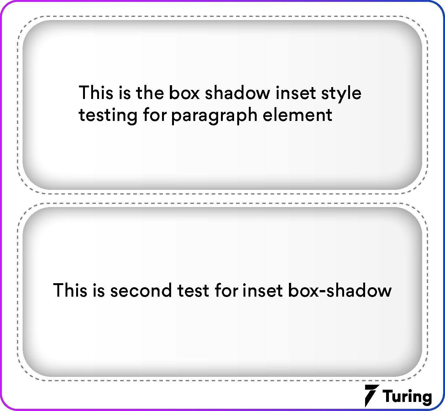
Here’s how you can achieve it for your element.
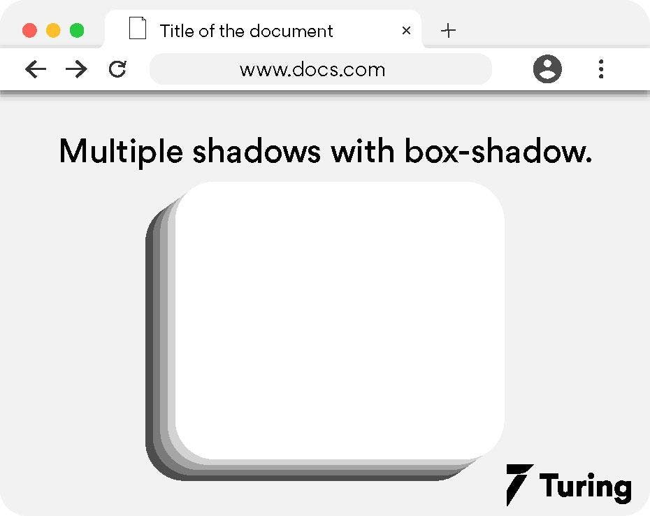
5. Add multiple shadows
To elevate the appearance of any element, we add multiple shadows to it so that it can instantly grab attention. To do so in the CSS, apply the code in a below-given manner with your choice of colors.
To give you an insight into how multiple shadows look, here’s an example that will clear it all.
Note: If the border radius is specified on the element along with a box shadow, the box shadow CSS takes the same rounded corners.
6. Setting 3 shadows
In order to get shadow only on three sides of the box, we will be including three shadows: an inset shadow, a regular drop shadow, and a 2px shadow to create a border effect.
Here’s a CSS code for the same.
The output for the same will look like this.

7. Neon shadows
In the real world, shadows are usually grey or black. But you can also add colors in the shadow on your website. You just have to change the color value on the box shadow to get the neon effect.
Let’s understand it in brief with an example.
The output for the above code will bring the following change in the box shadow.

Additional tips for creating effective box-shadow
An overdose of anything can ruin your website design. The same goes for the box-shadow usage. Even though it’s a great way to make your website look aesthetically pleasing, if not used properly, can ruin your project entirely. In order to avoid such failures, here are some expert-recommended tips for you.
1. Maintain consistency
Ensure that all the elements that have box shadow CSS look similar. If you are using different shadow for various elements on your website, it will look haphazard.
2. Stick to minimalism
Adding many layers of shadows can lead to delay in page load. Even though the updated devices may not encounter this issue, users with older devices won’t be able to access your website, thus increasing the bounce rate.
3. Make use of animations
The idea of using animations on the box shadow can affect the performance of your website. We recommend that you use the animations sparingly, as the property of box-shadow already looks great with all its features and properties.
Alternative for a quick box-shadow
You may not always have the time to write multiple lines of code to create and apply box-shadow property in CSS. In such a scenario, you can leverage a great tool, shadows.brumm.af that quickly helps you create layered shadows.
You can add as many as 10 layers of box shadow to your object. You don’t have to worry about manually entering multiple values to get the perfect shadow with it. Start by simply setting the properties and preview in the box shadow. Next, copy and paste the code into your CSS project and you are good to go.
Here is an image representing the same.

Once you are done with the above window, you will get a code that can be used in your project.

We have covered box-shadow property from scratch to how you can bring realism to your website. Try your hand at styling some shadows yourself. Go creative by combining the colors, adding layered shadows, neon colors to shadows, and more, to see what works best for your project.
Do remember to test it all on as many devices as possible to ensure optimal website performance. With all this, you will be a shadow expert that knows ample ways to add creativity with a minimal piece of design.

Author
Srishti Chaudhary
Srishti is a competent content writer and marketer with expertise in niches like cloud tech, big data, web development, and digital marketing. She looks forward to grow her tech knowledge and skills.