Leverage Turing Intelligence capabilities to integrate AI into your operations, enhance automation, and optimize cloud migration for scalable impact.
Advance foundation model research and improve LLM reasoning, coding, and multimodal capabilities with Turing AGI Advancement.
Access a global network of elite AI professionals through Turing Jobs—vetted experts ready to accelerate your AI initiatives.
FOR DEVELOPERS
The Importance of Data Visualization in Data Science
Data by itself can be difficult to understand and interpret, which is why data science visualization is so important. By using visualization tools and techniques, data scientists can convert complex data into visual representations, such as charts, graphs, and maps, which are easier to comprehend and interpret.
Data visualization can also help to identify patterns, trends, and outliers in data that may not be immediately apparent when analyzing raw data. Data scientists can quickly identify relationships and patterns that can lead to new insights and discoveries. Data visualization can also help to identify data quality issues, such as missing or incorrect data, which can affect the accuracy of the analysis.
This article will explore data science and visualization, the types, and the tools used.
Table of Contents
What is data visualization?
Data visualization is the practice of representing data and information using visual elements. It involves transforming complex datasets into intuitive and easily understandable visual representations. It serves as a powerful tool for exploring, analyzing, and communicating insights hidden within data.
By presenting data visually, patterns, trends, and relationships can be easily identified, enabling individuals and organizations to make informed decisions. Effective data visualization enhances data storytelling and enables audiences to grasp key messages and draw meaningful conclusions.
It plays a crucial role in fields such as business, science, journalism, and public policy, allowing stakeholders to derive actionable insights and drive impactful outcomes from data.
Benefits of data science visualization
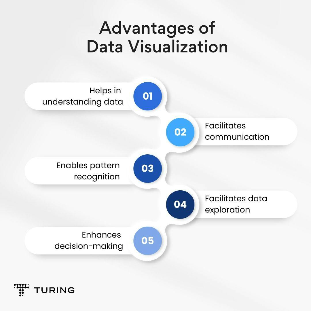
Here are a few ways visualization can facilitate data-driven tasks:
1. Helps in understanding data: Data science visualization is an effective way to gain insights into complex datasets because it presents the data in a visual form that is easy to understand.
Consider a large dataset containing customer preferences for a particular product. Using visualization techniques like histograms, scatter plots, and heat maps, we can see which features of the product are most popular among customers and which ones are not. This information can be used to improve the product design or marketing strategy.
2. Facilitates communication: Data science visualization provides a way to properly communicate the findings of data analysis to stakeholders.
For example, a financial institution wants to share information about its loan portfolio with its investors. With the help of bar charts, pie charts, and line charts, it can convey important information about the performance of its loan portfolio, such as the distribution of loans by type, the percentage of loans that are delinquent, and the percentage of loans that are performing well.
3. Enables pattern recognition: Visualization enables data scientists to identify patterns and trends in data that may be difficult to discern from raw data alone.
For instance, consider a healthcare provider that wants to identify trends in patient data in order to improve patient outcomes. Through visualization techniques, it can easily see which factors are most strongly correlated with positive patient outcomes and which are not. This information, in turn, can be used to develop more effective treatment plans.
Also read: How is data science application transforming industries
4. Facilitates data exploration: Data science visualization allows us to explore data by interacting with it in real-time.
For example, a marketing team wants to explore customer data to identify opportunities for targeted marketing campaigns. Using scatter plots and heat maps, it can filter and manipulate the data to identify segments of customers that are most likely to respond to a particular marketing campaign.
5. Enhances decision-making: By delivering insights and enabling us to understand data better, data science and data visualization can help us make better decisions.
Let’s consider a retail company that wants to improve its sales performance. With the aid of visualization techniques, the company can see which products are performing well. The information can be used to make data-driven decisions about which products to stock, which to promote, and which to discontinue.
Also read: Anticipating customer behavior with market basket analysis
Common data visualization types

Plots and graphs are commonly used in data science to communicate complex information. There are various types, including scatter plots, line graphs, bar charts, histograms, box plots, and heat maps, among others. Each type has its own specific use case and can represent different types of data.
1. Scatter plot: This is a data science chart that shows the relationship between two variables. Each point on the plot represents a pair of values for the two variables. It is useful for identifying patterns and trends in data.
Example use case: A marketing company is trying to identify which marketing channels are most effective for driving sales. You could use a scatter plot to plot the relationship between ad spend and sales for each marketing channel. This would enable you to identify channels that have the strongest correlation between ad spend and sales.
2. Bar chart: A bar chart is a plot that shows the frequency or proportion of categorical data. The x-axis represents the categories and the height of each bar represents the frequency or proportion of the category. It is useful for comparing the frequency or proportion of different categories.
Example use case: A restaurant wants to identify which menu items are most popular. A bar chart could be used to plot the number of orders for each menu item. This would enable you to identify which menu items are ordered most frequently.
3. Line chart: This is a data science chart that shows the trend of a variable over time. The x-axis represents time and the y-axis represents the values of the variable. It is useful for showing how a variable changes over time.
Example use case: A healthcare company wants to identify trends in patient data. A line chart could be used to plot the average blood pressure of patients over time, thereby allowing you to identify any trends in blood pressure over time.
4. Heat map: This is a plot that shows the values of a variable using color. The x-axis and y-axis represent two variables and the color of each cell in the plot represents the value of the variable. It is useful for identifying patterns and trends in data, particularly when there are many variables.
Example use case: A financial institution is trying to identify which loan products are most profitable. A heat map can be used to plot the profitability of each loan product, with different colors indicating different levels of profitability. This would help identify which loan products are most profitable.
5. Histogram: A histogram is a plot that shows the distribution of a variable. The x-axis represents the values of the variable and the y-axis represents the frequency or proportion of each value. It is useful for identifying the range and shape of the distribution of a variable.
Example use case: A social media company seeks to identify the distribution of user engagement on their platform. With a histogram, you could plot the number of likes for each post to find out the range and shape of the distribution of likes.
6. Box plot: A box plot shows the distribution of a variable using quartiles. The box represents the middle 50% of the data, the whiskers represent the range of the data, and the dots represent outliers. It is useful for identifying the range and shape of the distribution of a variable, especially when there are many outliers.
Example use case: A retail company is looking to identify the distribution of customer spend. You could use a box plot to plot the spending for each customer, with the boxes representing the middle 50% of customers and the dots representing outliers. This would help identify the range and shape of the distribution of customer spend.
Data science visualization tools
There are many data visualization tools for creating plots and charts. Here are some of the most popular:
1. Python libraries: Python is a popular programming language for data science, and there are many libraries available for creating plots and charts. Matplotlib, Seaborn, and Plotly are often used for data science visualization.
2. R packages: R is another popular programming language for data science. It also has many packages for creating plots and charts. Popular ones include ggplot2, lattice, and ggvis.
3. Tableau: Tableau is a powerful data visualization tool that lets users create interactive dashboards and reports. It supports a range of data sources and allows users to easily create and share visualizations.
4. Excel: Excel is a widely used spreadsheet program that includes basic charting functionality. It's often employed for quick data exploration and visualization.
5. Power BI: Power BI is a data visualization tool from Microsoft that lets users create interactive dashboards and reports. It supports a range of data sources and allows users to easily create and share visualizations.
6. D3.js: D3.js is a JavaScript library for creating dynamic and interactive data visualizations in web browsers. It's often used for creating custom visualizations that are impossible to do with other tools.
Use cases of data science visualization
1. Business: In business, data science visualization is a crucial tool for understanding and communicating insights from data. Sales teams can track sales trends and identify areas for improvement.
Marketing teams can monitor social media engagement and track the performance of advertising campaigns. Meanwhile, business leaders can monitor key performance indicators (KPIs) like revenue, profit margins, and customer retention rates.
Tools like Tableau and Power BI are particularly popular in the business domain as they allow users to create interactive dashboards and reports that can be shared with stakeholders.
2. Healthcare: Visualization is used in healthcare to monitor patient outcomes, track disease outbreaks, and analyze medical imaging data. Epidemiologists can track the spread of infectious diseases and identify potential risk factors. Radiologists can analyze medical images and detect abnormalities.
Data visualization is also used to monitor hospital performance and improve patient outcomes. Python libraries, R packages, and Tableau are commonly used in healthcare data analysis.
3. Finance: In finance, data visualization is used to analyze stock market trends, monitor financial performance, and track investments. For example, financial analysts can identify investment opportunities, while finance teams can track financial performance metrics like revenue, profit, and expenses.
Excel, Python libraries, and Tableau are widely used in financial data analysis.
4. Government: Data science visualization is used to monitor public health and safety, track economic indicators, and support decision-making. For instance, public health officials can track the spread of infectious diseases and identify potential risk factors. Economic analysts can monitor economic indicators such as GDP, unemployment rates, and inflation.
Data visualization is also used to support decision-making in government agencies, such as identifying areas for investment and measuring the impact of policy initiatives. Python libraries, R packages, and Tableau are commonly employed.
5. Marketing: In marketing, data science visualization is used to track customer behavior, analyze advertising campaigns, and monitor social media engagement. Marketers can track website traffic, monitor the performance of email campaigns, and identify customer preferences. Meanwhile, social media analysts can monitor social media engagement and track the effectiveness of social media campaigns.
Tableau and Power BI are particularly popular in marketing data analysis.
Python code examples
Let’s explore some common plots using Python.
1. Scatter plot:
import matplotlib.pyplot as plt import numpy as npGenerate some sample data
x = np.random.randn(100) y = np.random.randn(100)
Create a scatter plot
plt.scatter(x, y)
Add axis labels
plt.xlabel("X-axis") plt.ylabel("Y-axis")
Show the plot
plt.show()
2. Line plot:
# Generate some sample data x = np.linspace(0, 10, 100) y = np.sin(x)Create a line plot
plt.plot(x, y)
Add axis labels
plt.xlabel("X-axis") plt.ylabel("Y-axis")
Show the plot
plt.show()
3. Bar chart:
# Generate some sample data x = ["A", "B", "C", "D", "E"] y = np.random.rand(len(x))Create a bar chart
plt.bar(x, y)
Add axis labels
plt.xlabel("X-axis") plt.ylabel("Y-axis")
Show the plot
plt.show()
4. Histogram:
# Generate some sample data x = np.random.randn(1000)Create a histogram
plt.hist(x, bins=20)
Add axis labels
plt.xlabel("X-axis") plt.ylabel("Frequency")
Show the plot
plt.show()
5. Box plot:
# Generate some sample data x = np.random.randn(100)Create a box plot
sns.boxplot(x)
Show the plot
plt.show()
6. Heat map:
import seaborn as sns import numpy as npGenerate some sample data
x = np.random.randn(100, 10)
Create a heatmap
sns.heatmap(x)
Show the plot
plt.show()
Common customization options that can be used to customize the appearance of the plots:
1. Scatter plot:
- Change the marker style, size, and color: plt.scatter(x, y, marker='o', s=50, c='blue')
- Add a title: plt.title("Scatter Plot")
- Change the background color: plt.rcParams['axes.facecolor'] = '#f2f2f2'
2. Line plot:
- Change the line style and color: plt.plot(x, y, linestyle='--', color='red')
- Add a legend: plt.legend(['Sine Wave'])
- Change the font size: plt.rcParams.update({'font.size': 14})
3. Bar chart:
- Change the bar color and edge color: plt.bar(x, y, color='green', edgecolor='black')
- Add error bars: plt.errorbar(x, y, yerr=0.1, fmt='o', color='black', capsize=3)
- Rotate the x-axis labels: plt.xticks(rotation=45)
4. Histogram:
- Change the number of bins: plt.hist(x, bins=30)
- Change the fill color and edge color: plt.hist(x, bins=20, color='#b3e5fc', edgecolor='black')
- Add a vertical line: plt.axvline(np.mean(x), color='red', linestyle='dashed', linewidth=2)
5. Box plot:
- Change the box color and line width: sns.boxplot(x, color='orange', linewidth=2)
- Add a title: plt.title("Box Plot")
- Hide the x-axis label: plt.xlabel("")
6. Heat map:
- Change the color map: sns.heatmap(x, cmap='YlGnBu')
- Add a color bar: plt.colorbar()
- Change the font style: plt.rcParams.update({'font.family': 'serif'})
Conclusion
Data science visualization is a critical component of data science that enables us to effectively communicate complex data insights to stakeholders so that they can make informed decisions based on the analysis.
The ability to analyze and interpret vast amounts of data has become very important in today's data-driven world. Data science visualization helps us to navigate this challenge by providing a way to make sense of large amounts of data quickly and effectively. We can discover new insights, identify data quality issues, and ultimately drive value for businesses and organizations.
Author

Turing
Author is a seasoned writer with a reputation for crafting highly engaging, well-researched, and useful content that is widely read by many of today's skilled programmers and developers.
Frequently Asked Questions

Press

Blog
